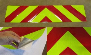
Selecting the Right Color and Intensity Reflective Material to Make a Vehicle more Visible – (www.chevronpanels.com)
Author – Steven Cole – (contact number and email – 850-934-3157 or steve@reflectivestore.com)
If you have been researching collision reduction or making a vehicle more visible you have no doubt come across the word “conspicuity”. As in conspicuity tape or conspicuity treatment. Conspicuity is defined as the characteristics of an object influencing the probability that it will be detected by coming to the attention of an observer. In other words, it is how easily something can be seen. For example, a bright yellow Ferrari is more conspicuous than a black one.
When marking commercial vehicles the goal is to make them more visible or conspicuous to the human eye. Color and luminance contrast are two factors that affect conspicuity. These factors are often what trigger recognition of an object.
The average human has an approximate 130 degree field of vision. Our central field of vision is where we see detail. Our central vision field makes up only 5% of the 130 degree field. Our periphery vision makes up the rest. Color alone is not sufficient to locate or distinguish objects in our peripheral field of vision. To detect objects in this area we need contrast and luminance as well as color.
Luminescence Contrast
 Luminescence is defined as the summed emission of visible light by an object, substance or material. In other words it is how bright or vivid something is. In this case we are interested in the visible light reflected from a surface to the human eye. The luminance of object depends on how much light strikes and object and how much is reflected. (Some materials reflect more light than others.) Luminance contrast is simply the difference in the brightness of two colors whether it be two colors side by side or one color in front of a dark or bright background.
The human eye distinguishes color and luminance through two types of photoreceptor cells. Cones and rods. Cones are more concentrated at the center of the eye while rods are more towards the outside or periphery. Cones distinguish color and detail. Rods are more sensitive to changes in luminance or movement. Rods require less light to function and are more efficient at night. Cones give us our central vision (color and detail) Rods give us our peripheral vision.
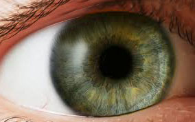 As you read this article, it is the cones in your eye that allow you to see the detail and contrast which is what allows you to see and read the words. As you focus on the words you will notice that you are also taking information in from your peripheral vision. This information is coming from the rods in your eye. If while you are reading this sentence, something moves in your periphery, you will notice it. Also, if there is a bright color that is out of the ordinary, you may see that as well. Try this. Click on the yellow and red picture above to make is larger. After you click on the image look 30 – 45 degrees to the right or left and focus on something besides the screen of your computer. Notice how in your periphery vision you can still see the bright yellow and red graphic.
In the daytime, the color of an object determines how bright or luminous it is. At night, with reflective sheeting, color and type both play a role in how visible the sheeting is. By type I mean the brightness of the reflective tape. (type 1, 2, 3, 5, 8) For example, a prismatic reflective material (type 5 or above) will be about 5 times brighter than a standard engineer grade (type 1) material. So at night, both color and type affect visibility. Because of this, we recommend a prismatic tape over the less intense tapes.
Color
Color is determined by which wave lengths of light are reflected back to the human eye. The wavelengths or combinations of wavelengths give us what we know as color or hue. Colors such as Fluorescent Lime/Yellow and Fluorescent Orange are considered to be the most conspicuous colors during the day and in low light conditions.
Definition of Fluorescent – the emission of light by a substance that has absorbed light or other electromagnetic radiation. It is a form of luminescence. Fluorescence makes a color look as if it is glowing.
They are more conspicuous in both the primary and periphery field of vision. The main fluorescent colors are lime/yellow and orange. Fluorescent lime is commonly seen in school zones and fluorescent orange is seen in work zones. Fluorescent colors are especially visible at twilight or dawn when the ultraviolet light from the sun is present in great proportions than in full sunlight.
Standard Red, Orange and Yellow are also conspicuous colors. Red and Orange are useful as contrasting colors with fluorescent lime or yellow being the alternating color.
Contrast
Brightness or Luminance is important but contrast is also needed for objects to be conspicuous. If you sheeted the back of a truck with just fluorescent lime or standard yellow material you would certainly make it more noticeable. However, by adding a contrasting color such as red or orange you greatly increase the trucks visibility in both the periphery and primary fields of vision.
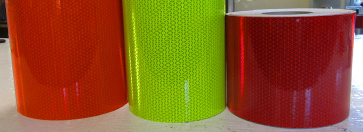
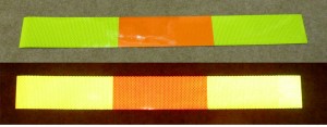
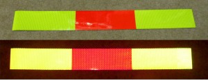
Red is often used with fluorescent lime yellow as a contrast color and is very effective. The most visible reflective panels would be red and fluorescent lime/yellow or orange and fluorescent lime/yellow. It is difficult to say which is the most visible. I would lean a little towards the lime/red because of the contrast. The picture below shows the three colors.
Fluorescent lime and red will give you a 3 to 1 contrast ratio.
Fluorescent lime and fluorescent orange will give you a 2 to 1 contrast ratio.
Fluorescent lime and standard orange will give you an approximate 2.5 to 1 ratio.
Summary
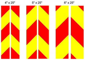
For maximum visibility we recommend you use a fluorescent lime/yellow material and a red or fluorescent orange or standard orange contrasting material. The chevron pattern is recommended but an alternating non slanting pattern is also effective. A chevron pattern slants down and out at 45 degree angles which is normally going to be different from other lines on a vehicle and therefore more conspicuous. However, there is no research that I know of that shows the chevron pattern to be superior to a simple alternating pattern. The main considerations are the brightness of the tape and the contrast.
Part Three of this series of articles will discuss the size of the panels, the type (slanted or non slanted) and the placement on the vehicle.
- Part 1 – Introduction – Improving the Visibility of Vehicles
- Part 2 – Choosing Colors, Intensity, Contrast
- Part 3 – Selecting the Type, Size and Placement

Steven Cole (Economics, MBA – University of West Florida , Business & Innovation – Stanford University) 25 years of experience in the reflective safety business. Specializing in accident reduction for vehicles through increased visibility.
